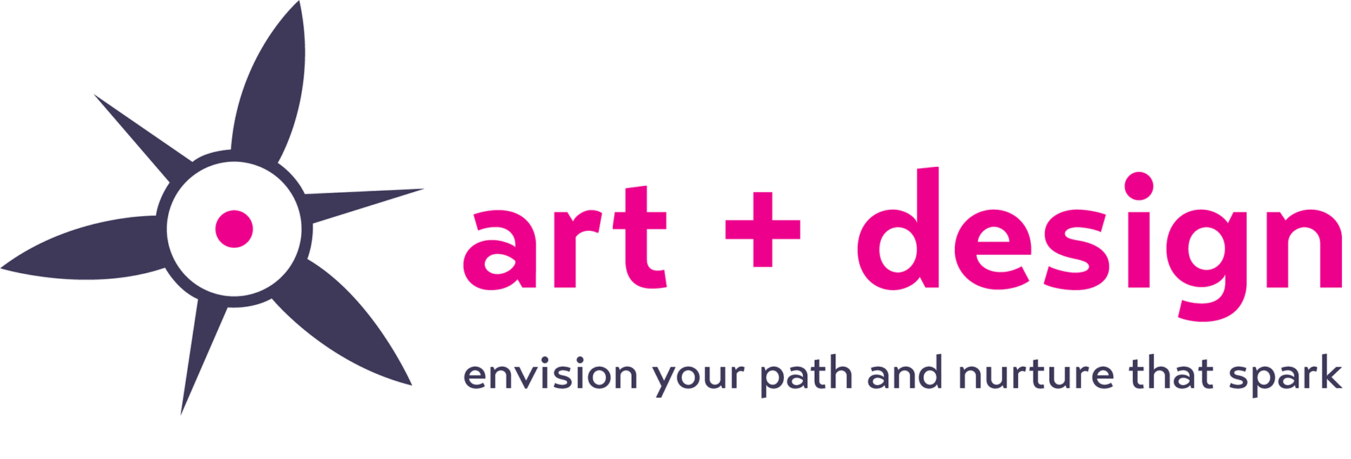
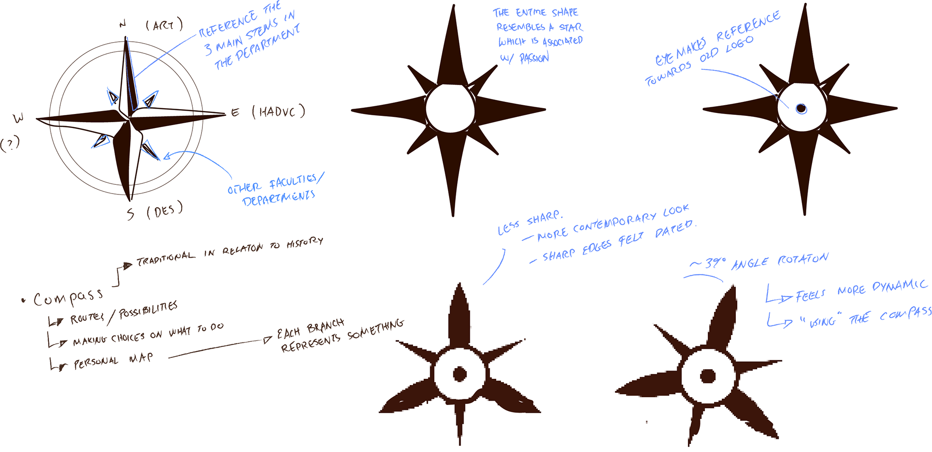
The objectives for this logo is to express something contemporary, flexible/ customizable, and rooted in tradition. There are also three main sections within the department: History of art, design, and visual culture (HADVC), arts (ART), and design (DES). The objectives of this assignment was to maintain rigor alongside how personable the program can be.
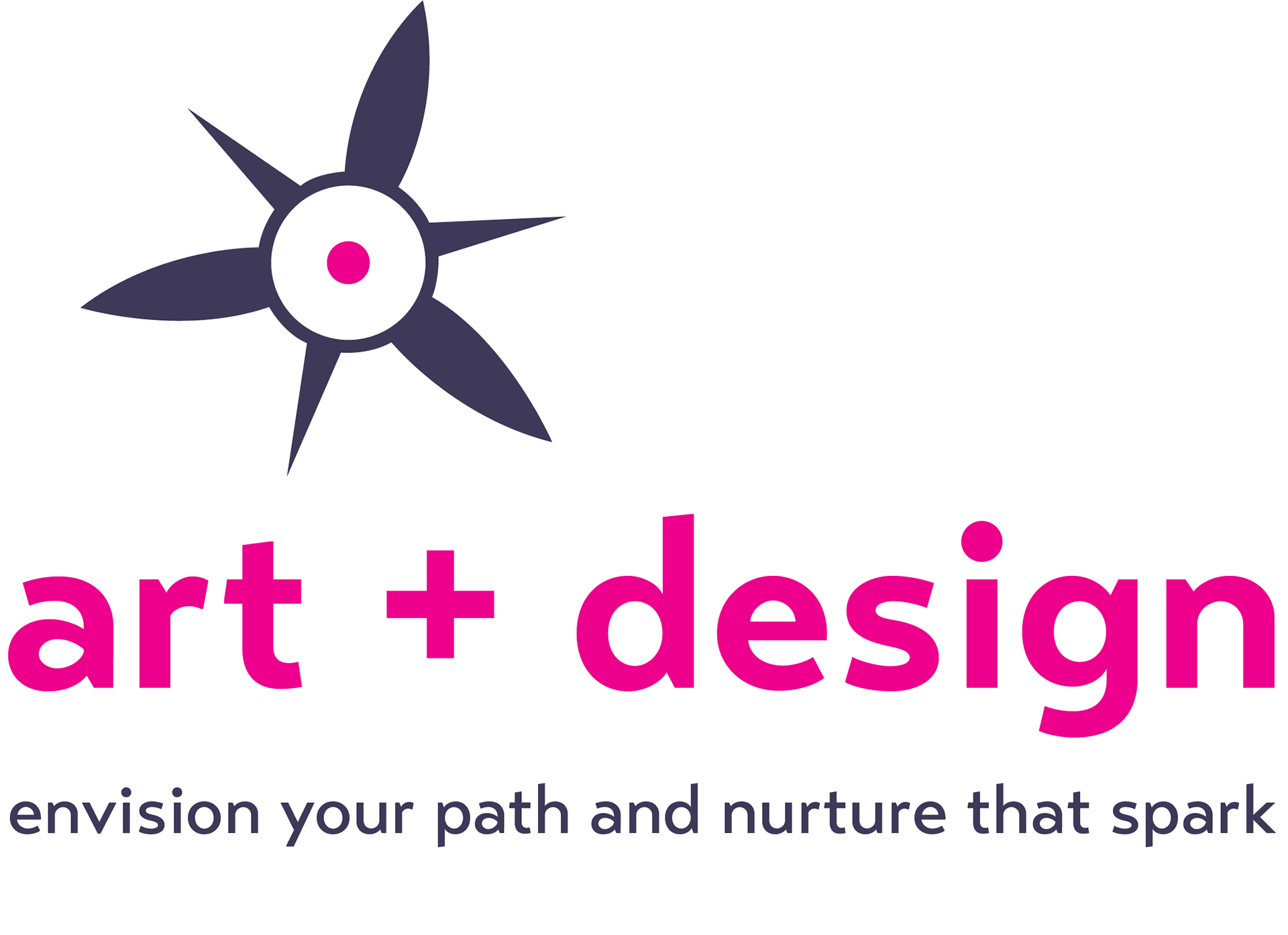
The logo concept surrounding the idea of different routes. visible in stablishing tradition through a familiar shape of a tradition compass, as well as referencing the previous logo that was an eye. The logo itself references not just the three main sections of the department, but also the potentials of reaching into other departments.
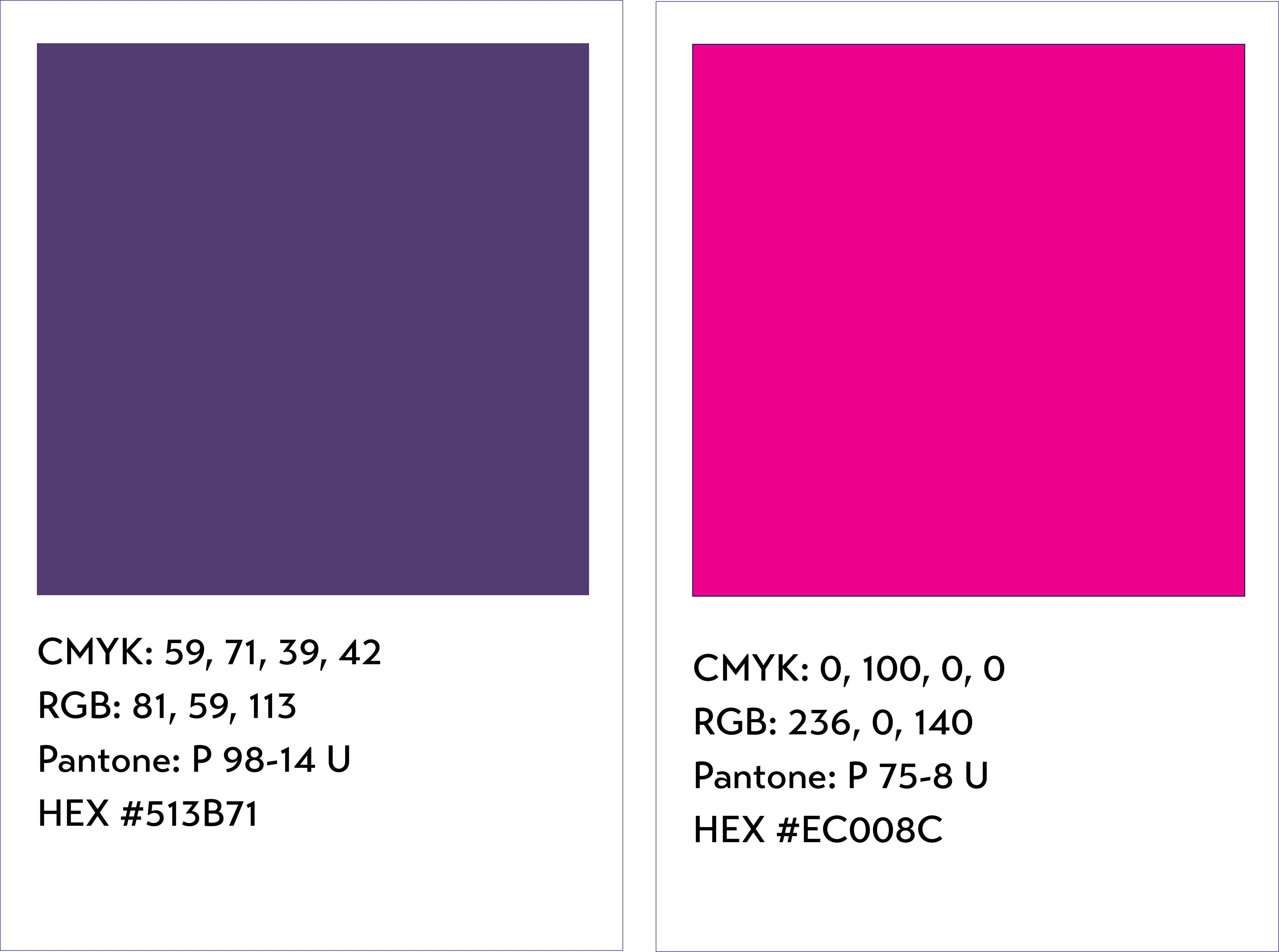
The colour choice of pink and purple/blue speak towards ideas of creativity, fun, and passion. Red being associated with passion, and so I attempted to use a bright magenta in order to appeal towards it in a fun way. The muted purpleish blue shade is darker and allows for the pink to really shine through, brigning attention to this passion burning from within the star like shape of the logo.
The typeface is a sans serif font named Transat Text. It is simple and contemporary. The type cannot be replaced, distorted, or altered in any way. The usage of both bold and medium weights are used within the logo. It is quite light and airy, remaining fun in that regard.
Transat Text Medium
ABCDEFGHIJKLMNOPQRSTUVWXYZ+abcdefghijklmnopqrstuvwxyz
Transat Text Bold
ABCDEFGHIJKLMNOPQRSTUVWXYZ+abcdefghijklmnopqrstuvwxyz